Welcome to a clean new design, inside and out.
Over the past few months, we’ve been hard at work refreshing the member experience. Today, we’re excited to start rolling out a more seamless way to navigate Tinder for our members around the world.
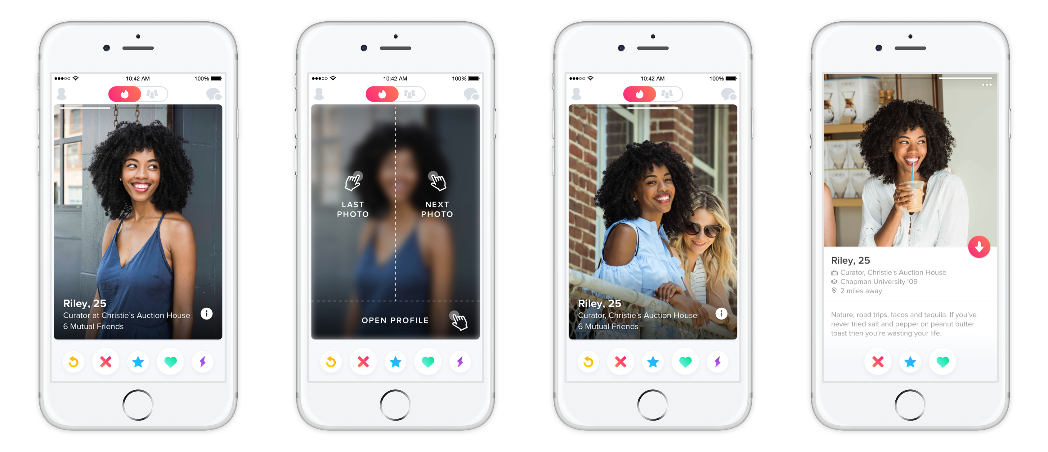
The Modern Touch
Now you can explore profiles more readily by tapping on the edge of a photo to navigate to the next photo and back again. When you tap the bottom of someone’s profile card, you’ll have a smooth transition to their complete profile view. It’s intuitive. It’s swift. It helps you find everything you want to know about a potential match—from their bio and shared connections, to their Anthem, top artists, or Instagram feed—quicker and easier than ever before.
The Big Picture
The new member experience is not only smarter, it’s better looking. Now, photos take up more real estate on Tinder—extending to the edge of your screen and giving you the bigger picture when it comes to your potential matches. It’s all part of an ongoing effort to make our app as fun and attractive as the community it serves.
The New Swipe Right
Beyond what you can touch and see, is an incredible story about how it was all built. To learn more about how Tinder’s latest build will change the game for our future development, check out our tech blog here.